AIO Terminal's most comprehensive update yet: the old "Order Book" tab has evolved into a full-featured Analytics tab — a complete market microstructure dashboard with 7 live data panels, all streaming in real time from Binance WebSocket. This article walks you through every component, how to read it, and how to combine the signals in a practical trading workflow.
Why a Dedicated Analytics Tab?
Most futures traders make decisions using lagging indicators on a price chart alone — moving averages, RSI, MACD — tools that describe what already happened. Market microstructure tells you what's happening right now: where the liquidity sits, who is aggressive, whether futures players are leading spot, and what the risk environment looks like at the macro level.
The Analytics tab was built to answer these questions without requiring multiple subscriptions, browser tabs, or specialized hardware. Everything you need is in one place, in the same interface where you execute.
The 7 Components: What Each One Does
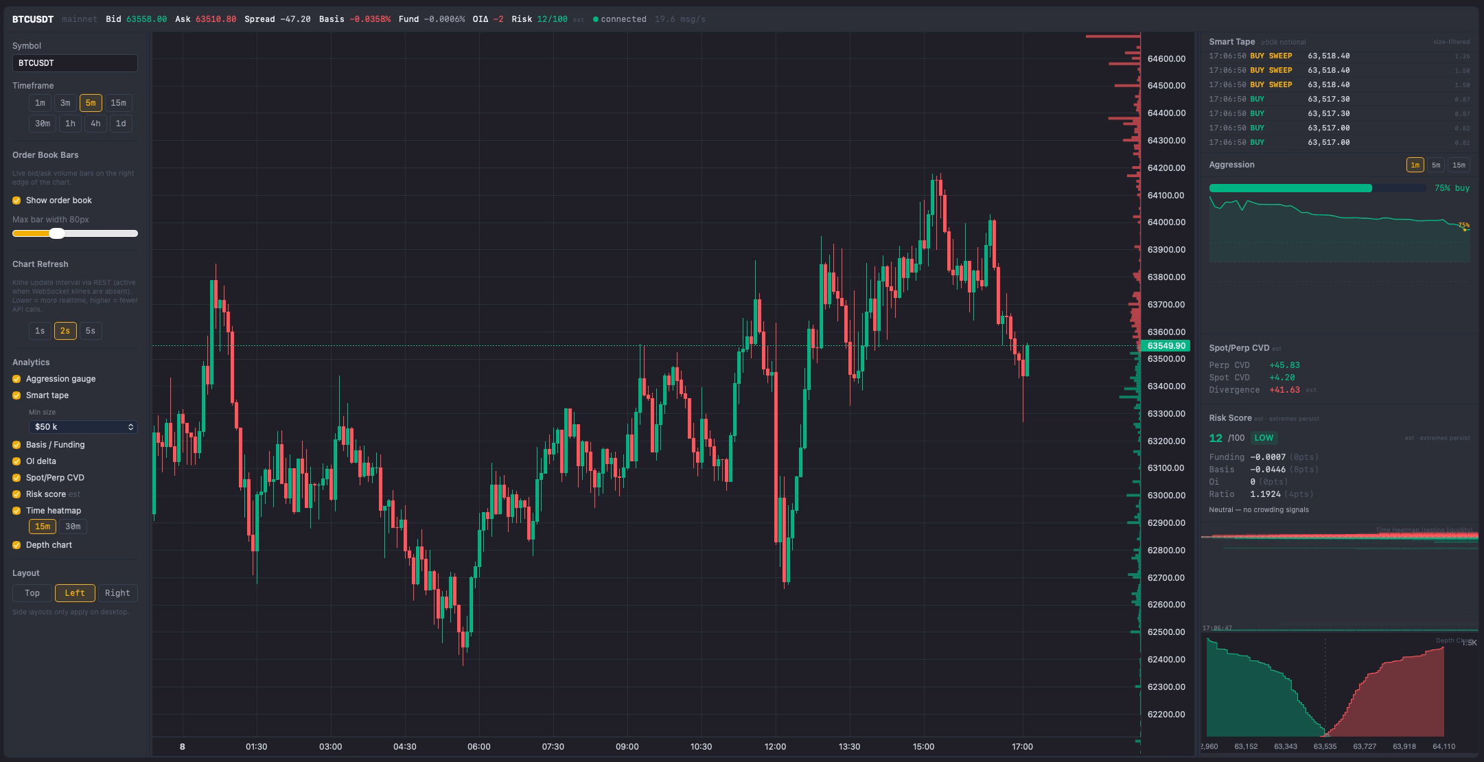
1. Chart + Order Book Bars
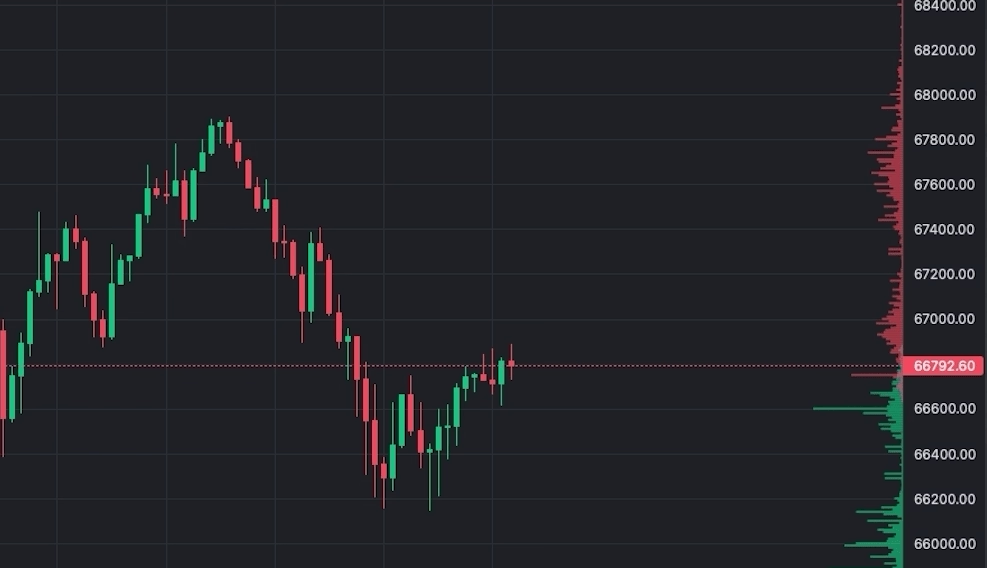
The Analytics tab opens with a full TradingView Lightweight Charts candlestick chart. On the right edge of this chart, live bid and ask bars are overlaid — each bar represents the total resting quantity at that price level. The normalisation is absolute-max: the widest bar on screen equals the highest liquidity level currently in the order book. All other bars are scaled relative to that maximum.
This makes whale walls immediately visible. When one price level has a bar that's 3–4× wider than its neighbors, that concentration of resting orders is significant. The bars update every 100ms from Binance's official @depth WebSocket stream — faster than any TradingView indicator can refresh.
- Green bars (left of mid price): Bid orders — buyers waiting to buy below current price
- Red bars (right of mid price): Ask orders — sellers waiting to sell above current price
- Configurable width: Adjust from 30px to 200px depending on how prominent you want the overlay
2. Cumulative Depth Chart
Below the main chart, the Depth Chart panel shows the cumulative total of resting orders on each side. The green curve represents total bid volume at each price level and below; the red curve shows total ask volume at each price and above. Where the two curves converge at the center, that's current mid price.
Reading the Colors
The Depth Chart uses a clear two-color convention:
- Green curve (left side): Cumulative bid volume — total resting buy orders from current price downward. Moving left along the green curve, each point shows the total buy-side depth available down to that price.
- Red curve (right side): Cumulative ask volume — total resting sell orders from current price upward. Moving right, each point shows how much sell-side supply must be absorbed to push price to that level.
- Where they meet (center): Current mid-price / spread. The gap between the left edge of the red curve and the right edge of the green curve is the bid-ask spread.
Reading the Depth Chart tells you the macro structure of liquidity rather than individual levels:
- Steep green or red curve near mid: Thick liquidity close to current price — small to medium orders won't move price significantly. A steeper green curve vs. red means more buy-side depth near mid (buyers are more committed at current levels than sellers).
- Flat "cliff" zones: Very thin liquidity at those price levels — if price enters this zone, it can gap quickly. These are targets for price to run to once a wall is absorbed.
- Green curve rising faster than red: Buyers have more cumulative depth close to current price than sellers — bullish near-term imbalance. The market has more committed buy orders than sell orders at comparable distances from mid.
- Red curve rising faster than green: More sell supply stacked above than buy support below — bearish near-term structure.
3. Aggression Gauge
The Aggression Gauge shows the buy/sell pressure ratio expressed as a 0–100 score, updated every ~1 second. A value of 50 indicates a perfectly neutral balance. Values above 65 indicate sustained buy-side pressure; values below 35 indicate sell-side dominance. The calculation window is configurable via a sidebar selector: 1m (most reactive — captures instant momentum shifts), 5m (balanced, good default), or 15m (smoothed trend, less noise). Match the window to your trade timeframe.
The gauge also displays a 15-minute sparkline alongside the current score. The sparkline always samples at 1-minute resolution regardless of which window you have selected — so it gives a consistent 15-minute historical reference no matter what. This lets you see whether pressure has been building, fading, or oscillating. A gauge that climbs from 45 → 72 over 10 minutes tells a very different story than one that spikes to 72 for 30 seconds and drops back.
Practical use: Before entering a breakout trade, check whether aggression is already elevated on the breakout side. A breakout with aggression > 70 is momentum-backed. A breakout with aggression at 48 is likely a false break — there isn't genuine pressure behind it yet.
4. Smart Tape
Smart Tape filters the real-time trade stream and shows only trades above a configurable notional threshold (default: ≥ 50,000 USDT). This eliminates retail-size noise and surfaces the trades that move markets. Each entry shows: side (BUY/SELL), size in USDT, and timestamp.
Critically, Smart Tape detects sweeps — three or more large same-side trades within a 500ms window — and flags them in yellow: ⚡ BUY SWEEP or SELL SWEEP. The tight 500ms window means a sweep only fires when a participant hit multiple price levels within half a second — genuine urgency, not just coincidence. This is one of the highest-conviction real-time signals available in market microstructure.
- Single large trade (e.g., $250k BUY): Elevated interest, but could be a hedger or position builder — not conclusive alone
- BUY SWEEP (3+ large buys within 500ms): A participant is executing with urgency, willing to pay up. This is directional conviction
- SELL SWEEP: Aggressive distribution — someone needs out now, not at the best possible price
The min-size threshold is a sidebar dropdown with five presets: $25k / $50k / $100k / $200k / $500k (default: $50k). Your choice is saved automatically. Use $25k for lower-cap assets (SOL, LINK) where $50k+ trades are rare, or raise to $200k+ when you want to track only large institutional clips on BTC. The tape displays a maximum of 60 rows, newest trade at the top — scroll down to see earlier entries within the session.
5. Spot/Perp CVD Divergence
CVD (Cumulative Volume Delta) tracks the net difference between buy-side and sell-side volume since the session anchor point. AIO Terminal calculates CVD for two markets simultaneously: USDⓈ-M Futures (perpetual) and Spot. The panel displays three live numbers — not chart lines — each with color-coded context: Perp CVD, Spot CVD, and the Divergence value (Perp CVD − Spot CVD).
Perp CVD and Spot CVD each show green when positive (net buying) and red when negative (net selling). The Divergence color is reversed by design — it acts as a contrarian risk/opportunity indicator: a large positive divergence (perp buying much harder than spot) shows red as a caution flag that futures may be over-leveraged. A large negative divergence (perp selling much harder than spot) shows green as a potential opportunity — futures may be oversold relative to spot.
The key signal is divergence, not level. Both CVD values are session-anchored — they reset to zero each time the server restarts and accumulate from there. What matters is the relative movement within a session: perp running ahead of spot in either direction is a signal worth reading — but not always in the direction you'd first expect.
6. Risk Score
The Risk Score is a 0–100 composite signal derived from four macro-level Binance data sources, updated every 5 minutes. Each component contributes a weighted portion of the total:
| Component | Weight | High score when… |
|---|---|---|
| Funding Rate | 30 pts | Funding > 0.03% — longs paying heavily, squeeze risk elevated |
| OI Growth | 25 pts | OI grew > 10% since session start — new leverage entering the market |
| Long/Short Ratio | 25 pts | L/S ratio > 1.5 or < 0.67 — positioning too crowded on one side |
| Basis | 20 pts | |Basis%| > 0.05% — futures premium vs. spot is stretched |
The panel also shows an auto-generated summary label identifying the dominant risk driver — for example: "longs paying high funding", "perp premium (bullish)", "long-heavy positioning", or at extreme levels: "⚠ extreme crowding — squeeze risk". These labels let you see why the score is elevated at a glance without doing mental arithmetic.
A low score (0–40) suggests a relatively safe environment — funding neutral, OI growth modest, basis tight. Scores above 70 indicate a highly leveraged market where a single catalyst can trigger cascade liquidations. At extreme levels, edge belongs to risk management, not signal chasing.
Note: Risk Score is advisory and does not trigger automated actions. "Extremes persist" — a high score can stay elevated during a strong bull run. Always combine with price action and CVD to determine direction.
7. Time Heatmap
The Time Heatmap is a Bookmap-inspired visualisation of resting liquidity across both price and time. Rather than showing the order book at a single instant, the Time Heatmap accumulates snapshots over the session and renders them as a 2D heatmap — brighter/larger cells indicate where large resting orders have been concentrated most consistently over time.
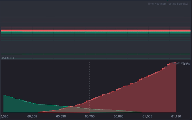
How to Navigate the Canvas
The heatmap canvas has two axes:
- Y-axis (price): Higher price = top, lower price = bottom. The canvas auto-scales to the full price range of the rolling window, so a white dotted line marks the current mid price. Don't worry about whether this line is near the top, middle, or bottom of the canvas — that just reflects where today's price sits within the last 15 minutes of range. Focus on the white line and what's immediately around it.
- X-axis (time): Left = older snapshots, right = most recent. Watching a wall from left to right shows whether it has been accumulating, thinning, or disappearing over time.
Reading the Colors
- Green cells = bid orders (buy limit orders) — they always appear below the white dotted line (below current price). Brighter/more intense = larger volume at that level relative to the session max.
- Red cells = ask orders (sell limit orders) — they always appear above the white dotted line (above current price). Brighter = larger resting sell volume.
The quick read: look at the white line and compare what's just below it (green) vs. just above it (red).
| What You See | What It Means |
|---|---|
| Thick bright green just below white line | Strong bid wall — buyers defending that level |
| Thick bright red just above white line | Strong ask wall — sellers blocking that level |
| Green thicker than red around white line | Buy side defending more actively than sell side is blocking |
| Bright column on left that disappears toward right | Wall was absorbed — price consumed those orders or they were cancelled (possible spoof) |
| Sparse, faint across the whole canvas | Thin liquidity — price can move fast with little resistance |
The heatmap window is configurable (15 or 30 minutes). Enabled via Settings → Show time heatmap (off by default, as it adds render cost).
Always-Visible Header: Basis, Funding Rate & OI Δ
Separate from the 7 panels, the Analytics tab header always shows three live macro metrics that update in real time. These are raw values — not processed into a score — giving you direct market context at a glance:
- Basis (Mark Price − Index Price): The premium or discount of futures versus spot. Positive basis (contango) = futures trading above spot, reflecting bullish sentiment. Negative basis (backwardation) = futures below spot, typically a fear or de-leveraging signal. When |Basis%| exceeds 0.05%, arbitrageurs typically act to compress the gap; above 0.1% is unusual.
- Funding Rate: The 8-hour cost transfer between longs and shorts (settled at 00:00, 08:00, 16:00 UTC). Positive = longs paying shorts — market is leaning long. Above +0.03%/8h means longs are absorbing significant carry cost and are more exposed to a forced unwind. Negative = shorts paying longs — heavy short positioning, potential short squeeze risk.
- OI Δ (Open Interest Delta): Change in total open positions since session start. Rising OI + rising price = new long positions being opened (trend confirmation). Rising OI + falling price = new shorts entering (bearish flow). Falling OI + price movement = existing positions closing — that's a squeeze or de-leverage, not fresh directional conviction.
A quick scan of all three together gives you immediate macro framing: if funding is spiking, basis is stretched, and OI is surging simultaneously, the Risk Score will reflect it — and the CVD Divergence may already be showing a warning sign.
How to Use the Analytics Tab: A Practical Workflow
Pre-Trade Context Check (2–3 minutes before entry)
- Risk Score: Is it above 70? If so, reduce leverage or skip longs entirely. High-risk environments flush leveraged positions without warning.
- Spot/Perp CVD: Is perp CVD trending the same direction as your intended trade? Confirmation from futures flow adds conviction.
- Time Heatmap: Identify persistent liquidity clusters near your entry and target. A thick wall near your intended stop suggests placing your stop beyond that level.
- Depth Chart: Is there a thin zone between current price and your target? Thin zones accelerate price movement — this supports a wider target.
Entry Timing (real-time, 30 seconds before)
- Aggression Gauge: Is pressure building in your direction? A gauge rising above 60–65 on a breakout confirms real pressure is behind it.
- Smart Tape: Any large trades or sweeps confirming your side? A BUY SWEEP just before your intended long entry is validation. Multiple sweeps in the same direction within a few minutes is institutional position-building.
During the Trade (monitoring)
- Watch the Order Book bars near your stop level. Is the bid cluster supporting your long still thick, or being absorbed?
- Watch Aggression. If it starts dropping while you're in a long, buying pressure is fading — consider tightening your stop.
- Watch Smart Tape for large SELL trades or SELL SWEEPS against your direction — institutional players distributing into your move.
Configuration Tips
- Symbol & Timeframe: Set to your primary trading pair and preferred candle interval. Order Book data streams regardless of candle interval.
- Smart Tape min size: Use the sidebar dropdown to choose from $25k / $50k / $100k / $200k / $500k presets. The default $50k works well for BTC. For lower-cap assets (SOL, LINK, DOGE) use $25k. For a pure institutional-only view on BTC, raise to $200k.
- Time Heatmap window: A 30–60 minute window balances recency with enough history to identify persistent walls. Adjust shorter for scalping or wider for swing trading context.
- Show/Hide panels: Each panel (Order Book bars, Depth Chart, Time Heatmap) can be toggled independently. If screen space is limited, hide what you're not actively using.
All settings are saved automatically in localStorage — your configuration persists across sessions.
How the Analytics Tab Compares to Dedicated Tools
Bookmap, Exocharts, and similar standalone tools offer deep microstructure visualisation — but they are separate subscriptions, separate windows, and separate execution interfaces. The workflow tax of switching between tools during a live trade is real: by the time you read the signal in one tool and act in another, the window may have closed.
AIO Terminal's Analytics tab is not positioned as a replacement for professional microstructure tools at the same depth. It is positioned as the right tool for the job when you want actionable microstructure context inside the same interface where you execute. The signal that matters most is the one you can act on immediately — and that's what the co-location of Analytics and execution tabs enables.
AIO Terminal: Analytics Tab Included Free
The full Analytics tab — all 7 panels — is available to all AIO Terminal users at no additional cost. Access is included with every VIP plan. Contact us on Telegram to get your terminal credentials.
See Analytics Tab Overview →Getting Started
If you're already an AIO Terminal user, press key 8 (or click the Analytics tab) to open the Analytics panel. Each tab in AIO Terminal has a keyboard shortcut — 1 for Long, 2 for Short, 4 for Close, 6 for TP/SL, 7 for Cancel, 8 for Analytics — all remappable in Terminal Settings. Select your symbol and interval — the data streams immediately. No additional setup required.
If you're new to AIO Terminal: access is included free with any VIP plan. After subscribing, contact us on Telegram (@nguyenthl) to receive your terminal credentials. Setup takes approximately five minutes.
For a deeper dive into specific Analytics components, see the related articles below.